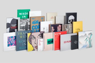
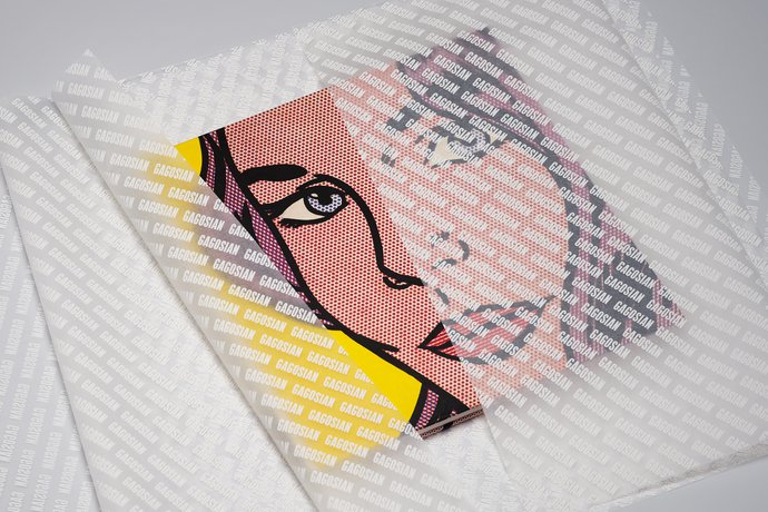
The introduction of Gagosian Gallery’s new visual identity was concurrent with the re-design of its magazine, Gagosian Quarterly, for which a new typographic system was required to present the gallery’s increasingly broad content – not only in this publication, but across all the gallery’s communication channels. Whether printed or electronic, all exhibition and events communications were to use the same visual tools and flexible system for the presentation of image- and text-heavy content.
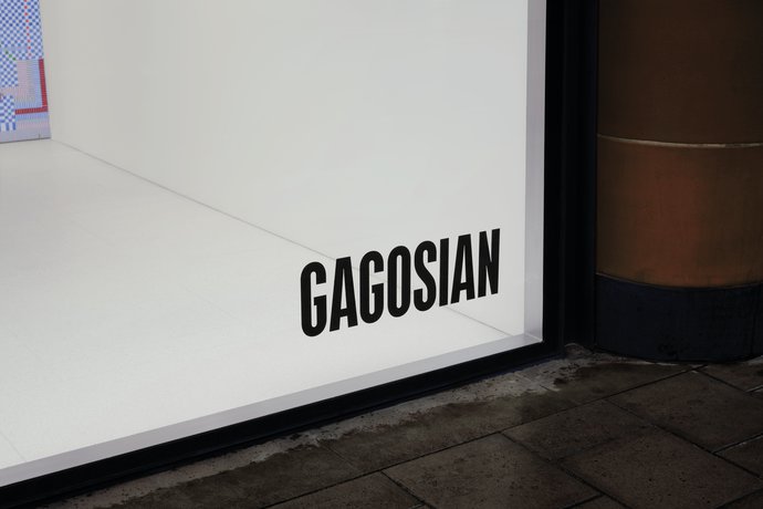
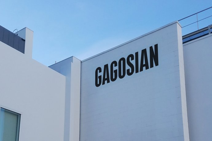
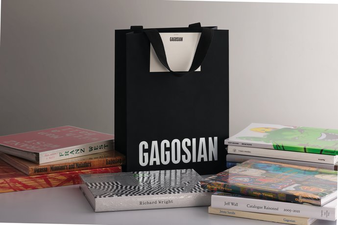
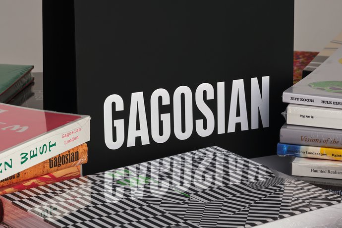
In creating Gagosian’s custom headline typeface, Gagosian Display, specific consideration was given to the drawing and spacing of the letters that form the word ‘Gagosian’, providing a cohesive unit not only for the magazine’s masthead but also for a shortened wordmark – omitting the word ‘Gallery’ provides a visual simplification that embraces the company’s diversifying business activities. The distinctive nature of the headline typeface maintains the gallery presence even when the logotype does not appear. Not overly idiosyncratic, its inclusivity negates any conflict with the visual aesthetic of the artists the gallery represents. In a similar way the neutrality of a black and white treatment avoids clashing with, and places emphasis on, the inherent palette of the artists’ work.
GTF partnered with web designer and developer Wolfram Weidner for the application of the identity to the rebuilt and expanded gallery website.