Menu

Graphic Thought Facility

Oki Nami – Identity, 1993, image 1
Oki Nami – Identity, 1993, image 2
Oki Nami – Identity, 1993, image 3
Oki Nami – Identity, 1993, image 4

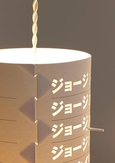
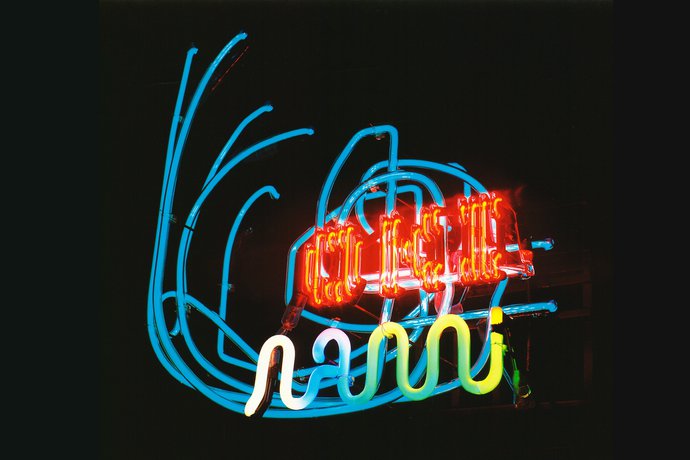
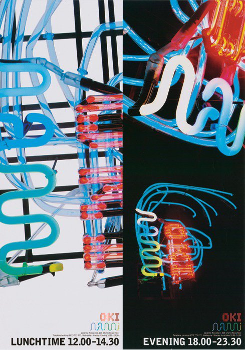
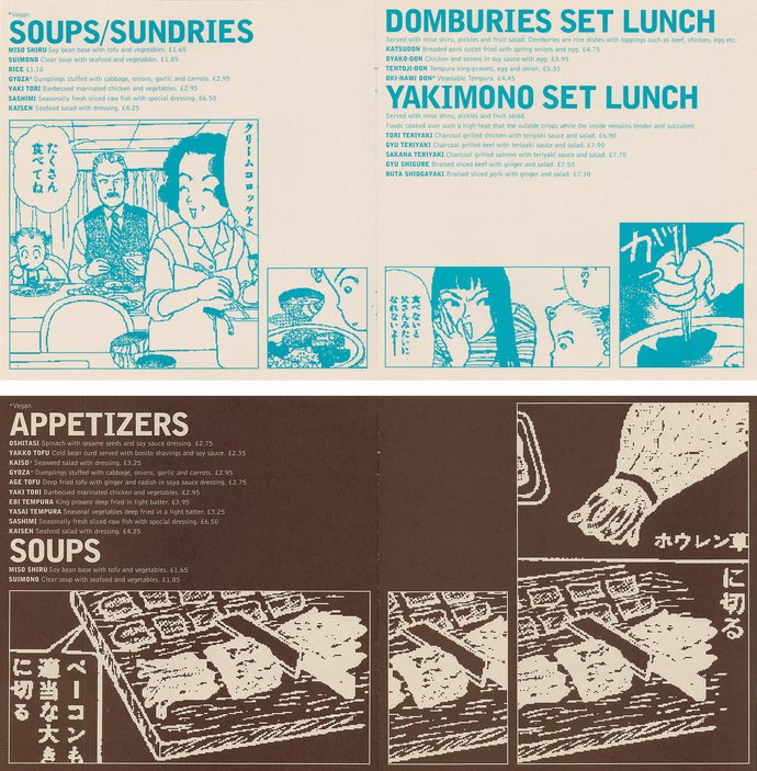
The focus of this Japanese restaurant’s identity was a jewel-like neon sign. In a reversal of the conventional relationship between identity design and shop-front application, the restaurant’s printed graphics were based on the neon forms.

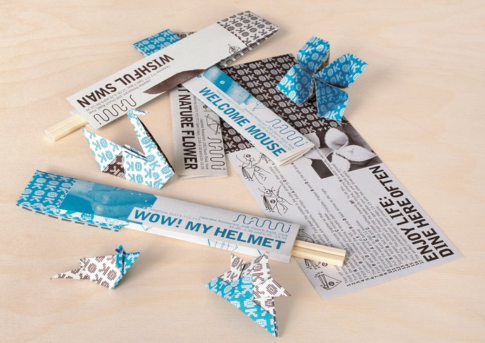
The primary elements of the identity were a logotype derived from the bent glass letters and a Space Invader-like character created by rotating the word ‘Oki’. The restaurant’s chopstick sleeves carried instructions for refolding into origami characters.

Photography: Andrew Penketh

Campaign Fedrigoni Image library
Campaign Vitra Vitra Classics
Campaign Kvadrat Kittens
Campaign Frieze Art Fair Fireworks
Campaign Kvadrat Shapes
Campaign Shakespeare’s Globe Theatre The Season of Regime Change
Exhibition Somerset House Miles Aldridge: I Only Want You To Love Me
Exhibition Science Museum Who am I?
Exhibition Art Institute of Chicago GTF: Resourceful Design
Identity Fedrigoni Paper Box
Identity Design Museum Identity
Identity Frieze Art Fair Identity
Identity Habitat Identity
Packaging Royal Doulton Olio
Packaging Herman Miller Formwork
Product Graphic Thought Facility MeBox
Publication Gagosian Catalogues
Publication Fendi The Fendi Set
Publication Richard Avedon Foundation Avedon Advertising
Publication Dior Dior Images: Paolo Roversi
Publication COS Creating with Shapes
Publication Gagosian Gagosian Quarterly
Publication Thames & Hudson M to M of M/M (Paris)
Publication Bloomsbury Heston Blumenthal at Home
Publication Gagosian Crash: Homage to JG Ballard
Retail Vitra VitraHaus
Wayfinding Hult International Business School Wayfinding